Excerpt:
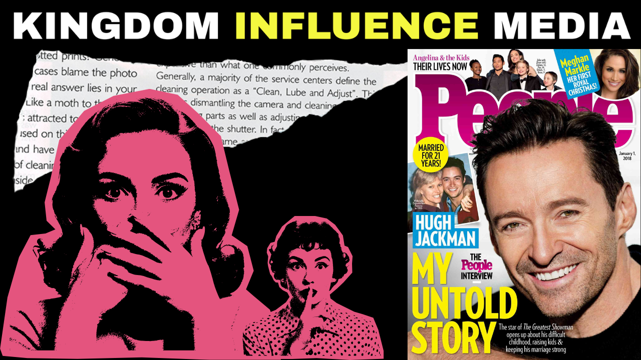
People Magazine has completely lost its charm. What was once a clean, classy publication full of heartwarming celebrity stories now looks like a chaotic mess stuffed with ads, pop-ups, and clickbait headlines.


Posted By: Julie
I can’t be the only one who feels like People Magazine looks absolutely sloppy now. Back in the day, it had this sophisticated, magazine-quality design — glossy photos, human stories that actually mattered, and layouts that felt inviting. Now? It looks like someone crammed a gossip blog and a shopping site together and hit publish.
Every time I go on their website, I feel like I’m dodging landmines. There’s a banner ad at the top, a video that plays automatically, and three pop-ups before I even finish reading the first headline. It’s like they forgot that readability matters. You can’t even scroll halfway down the homepage without getting lost in all the visual noise.
Even their content feels different — it’s all clickbait headlines and shallow celebrity blurbs. “Exclusive” stories that aren’t really exclusive, “breaking news” that broke two hours ago on Twitter, and “heartfelt” stories that are recycled press releases. I remember when People used to tell real stories — families reunited, inspiring survivors, actual profiles that made you care. Now, everything reads like it was written to chase trending keywords instead of telling a genuine story.
The design is another story altogether. The fonts clash, the spacing is inconsistent, and the mobile layout feels like a bad copy of TMZ and Us Weekly combined. There’s no flow — just clutter. They’ve become a victim of their own traffic strategy. It’s all about maximizing clicks, ad impressions, and scroll depth, not building trust or engagement.
And don’t even get me started on the sidebar madness — twenty “you might like” thumbnails that look like they were picked by an algorithm on caffeine. I’m all for modernization, but when your brand identity turns into a maze of sponsored links and recycled news, that’s not innovation — that’s desperation.
What hurts most is knowing People Magazine was once iconic. It wasn’t just celebrity gossip — it was the voice of American pop culture. When they featured someone, it meant something. Now, you scroll through their feed and can’t tell what’s editorial and what’s advertisement. The distinction is gone, and so is the credibility.
Honestly, People needs a reset. A cleaner layout, real stories, fewer ads, and a focus on depth over quantity. Because right now, the website doesn’t feel like People Magazine — it feels like a never-ending tabloid scroll that’s given up on quality for clicks.
If they keep going in this direction, they’re going to lose the audience that made them famous — the ones who valued storytelling over social media trends. Sometimes, chasing digital relevance just means losing your roots.